Identity

Finch Bakery

Giving a cult bakery a visual language as bold as its personality.

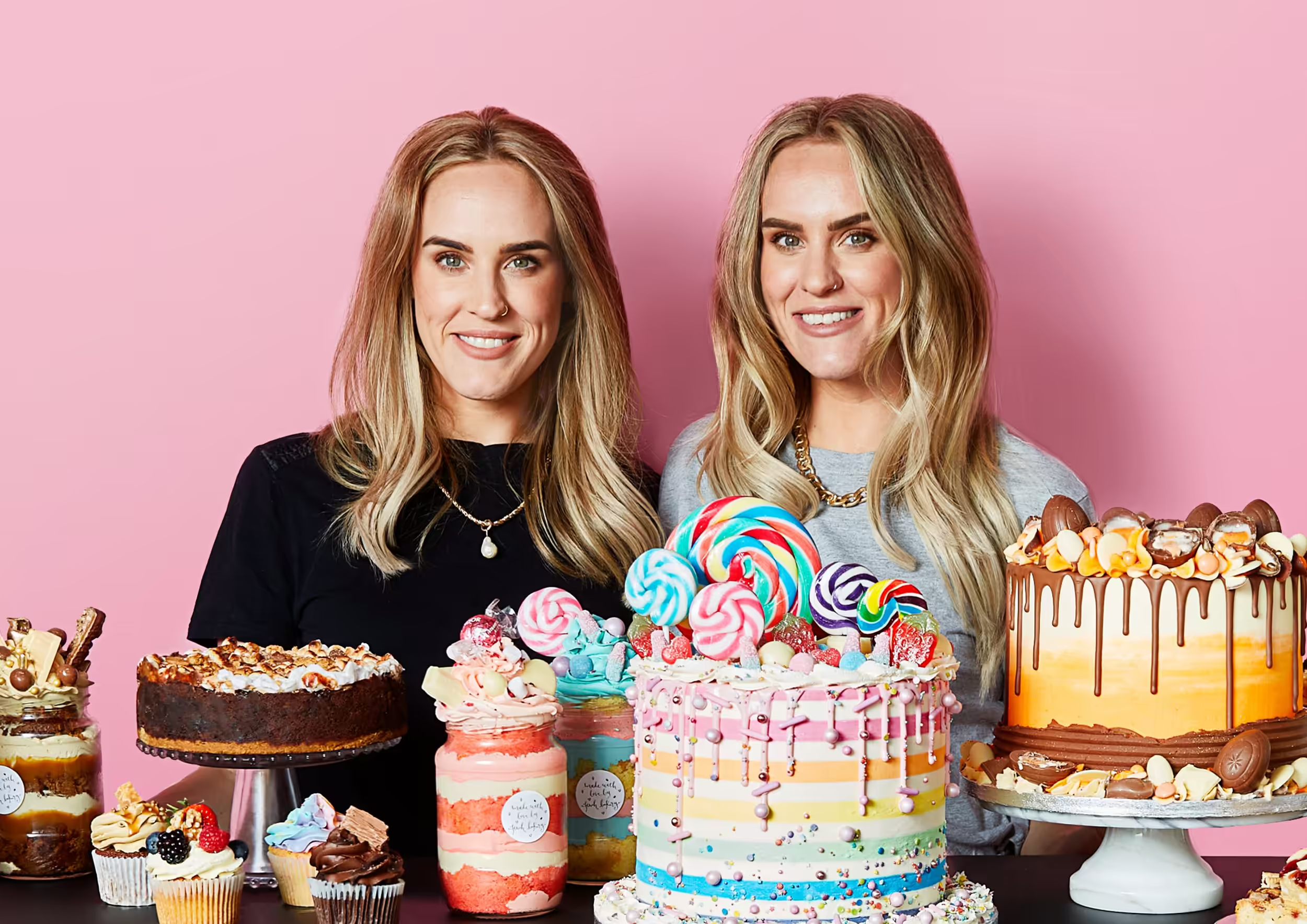
When I began working with Finch Bakery, Lauren and Rachel had already created something exceptional: extravagant products, an instinctive command of social media and a personality unlike anything else in the category.

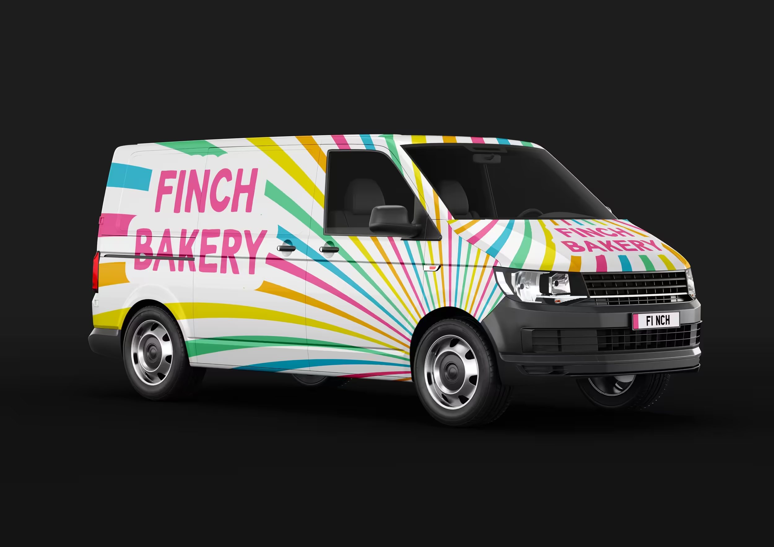
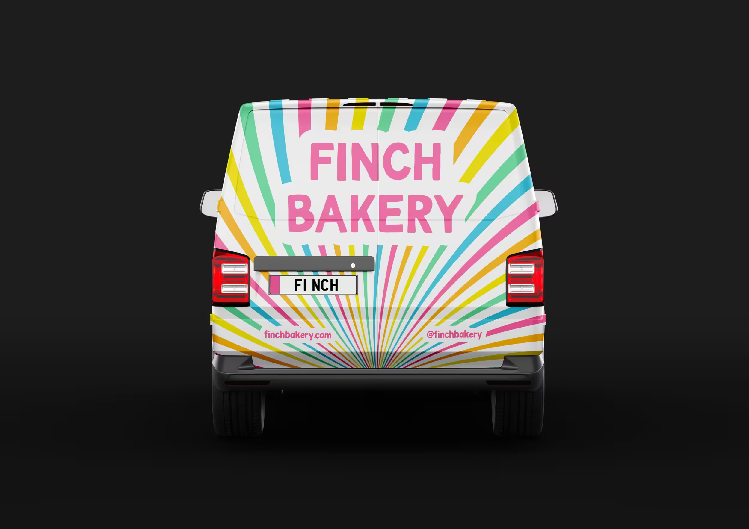
Our evolving creative partnership translated that energy into a distinctive brand world built to grow across packaging, publishing, campaigns, motion, vehicles and retail.
Role

Creative Director and Lead Designer

Scope

Strategy · Direction · Identity · Packaging · Publishing · Motion

Beyond the traditional bakery

Baking brands often reach for nostalgia: delicate scripts, pastel florals and a carefully polished kind of sweetness. Finch Bakery had always been something else.

Its audience came for extravagant products, saturated colour, irreverent humour and the feeling that something exciting might happen at any moment. The identity needed to preserve that spontaneity while giving the business greater confidence, recognition and room to grow.

Not dainty. Not nostalgic. Not quiet.

Bold. Modern. Generous. Unmistakably Finch.

From a cake to an ownable gesture

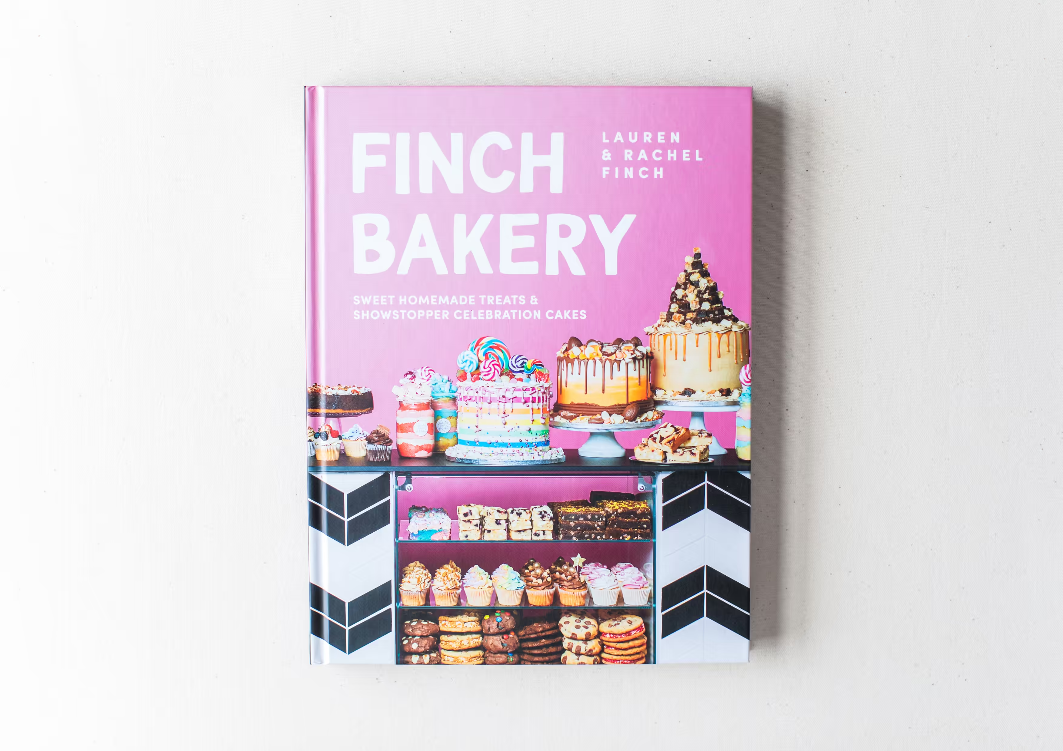
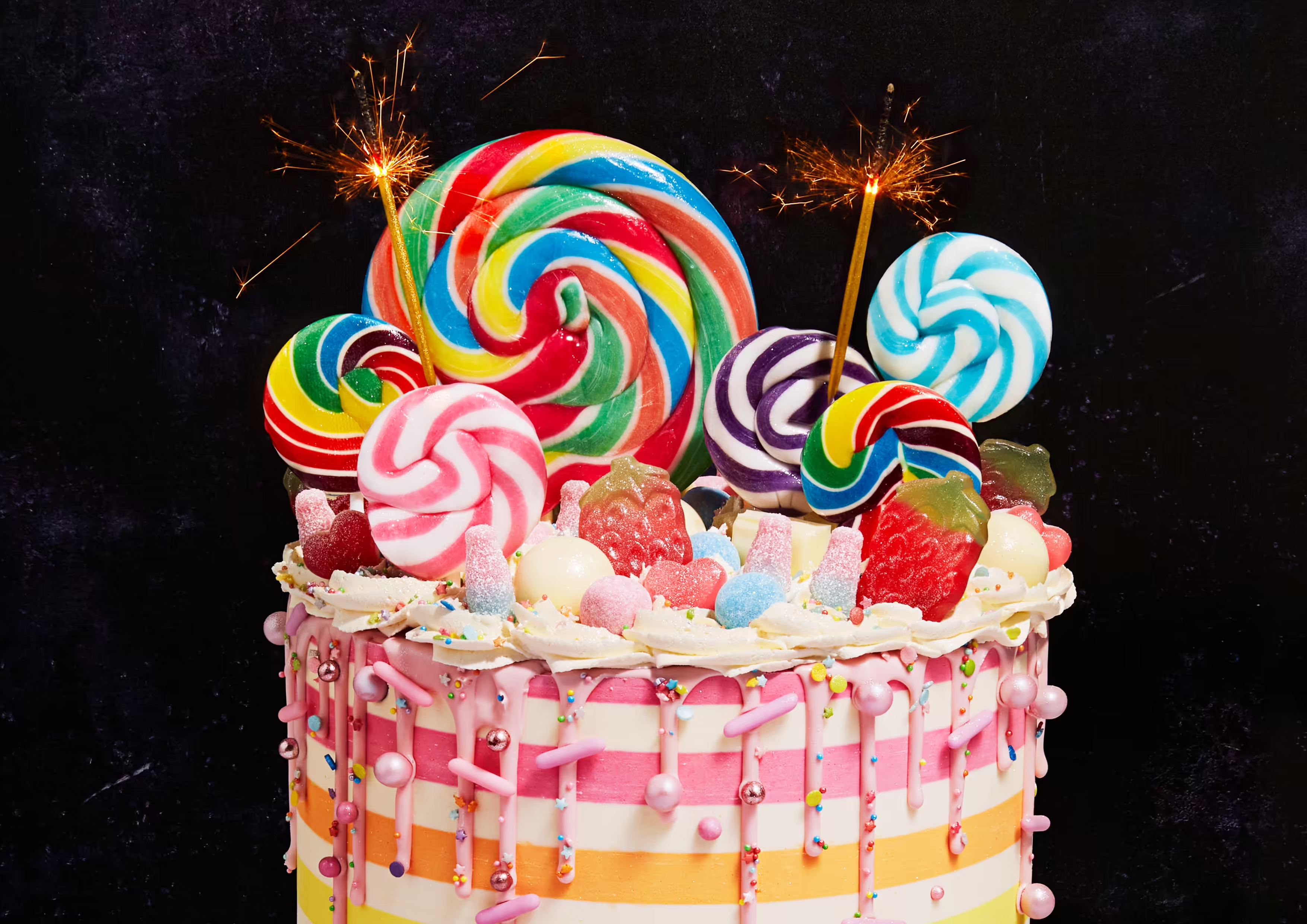
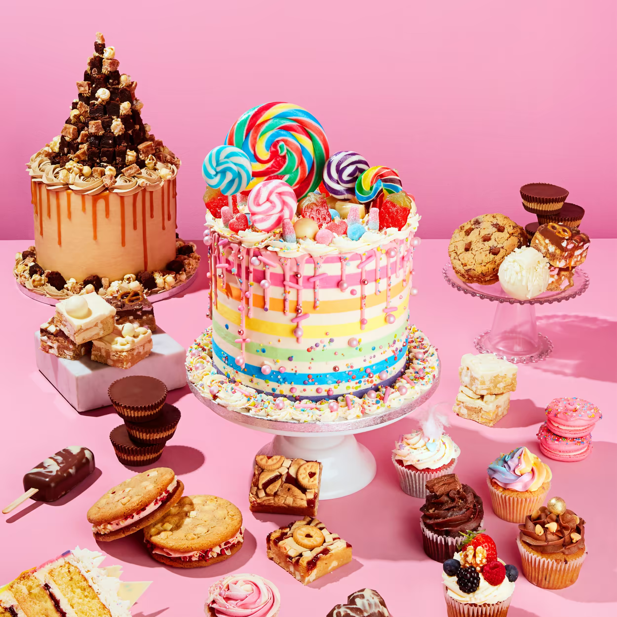
The defining idea emerged while creating Finch’s first recipe book. Its cover featured a striped celebration cake crowned with multicoloured spiral lollipops — a single image that captured the colour, craft, movement and exuberance of the business.

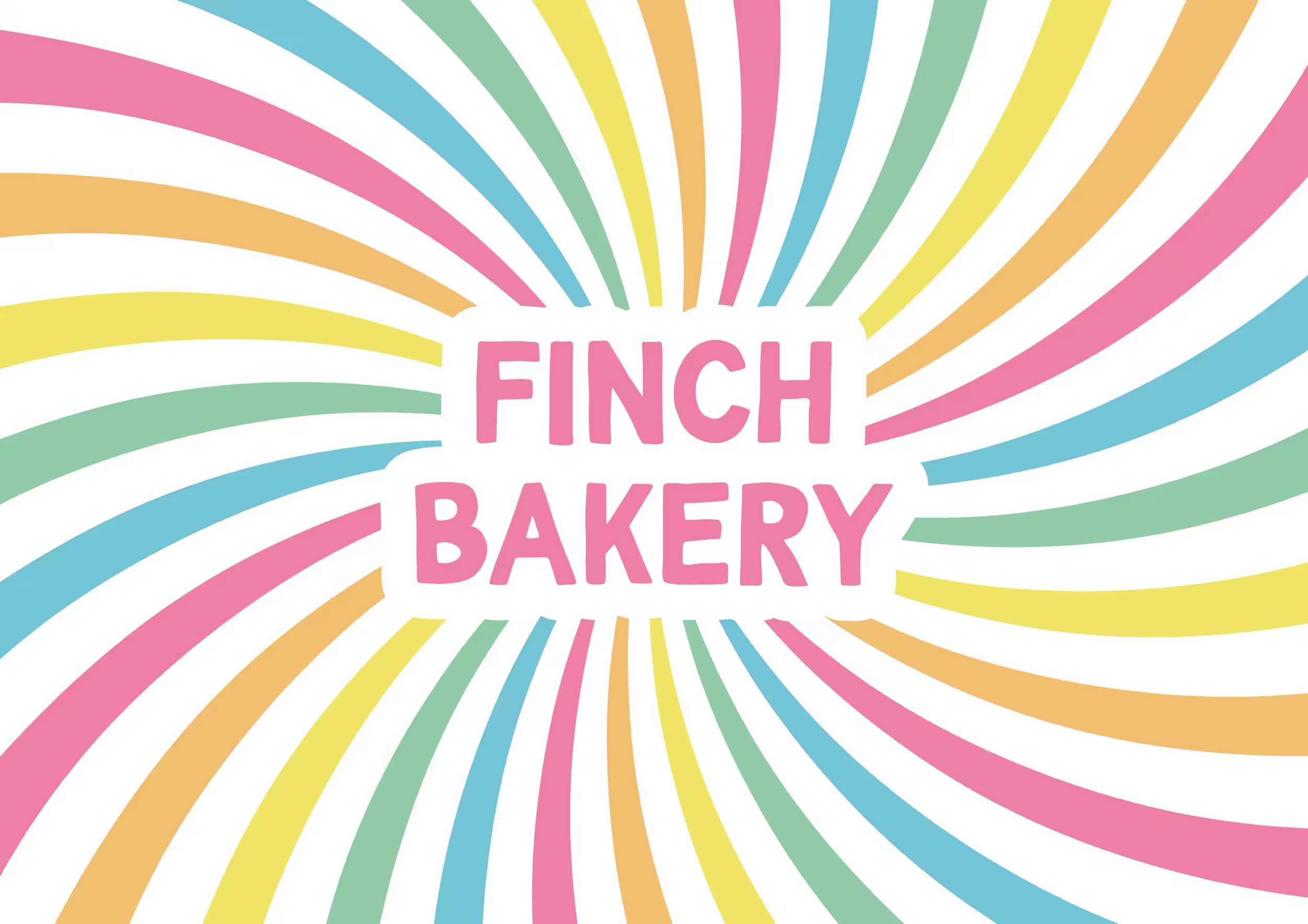
I translated that moment into a precisely constructed spiral that could hold the wordmark, expand beyond the frame, rotate, animate or reduce to its simplest form — one recognisable gesture able to behave differently wherever it appeared.

Personality without preciousness

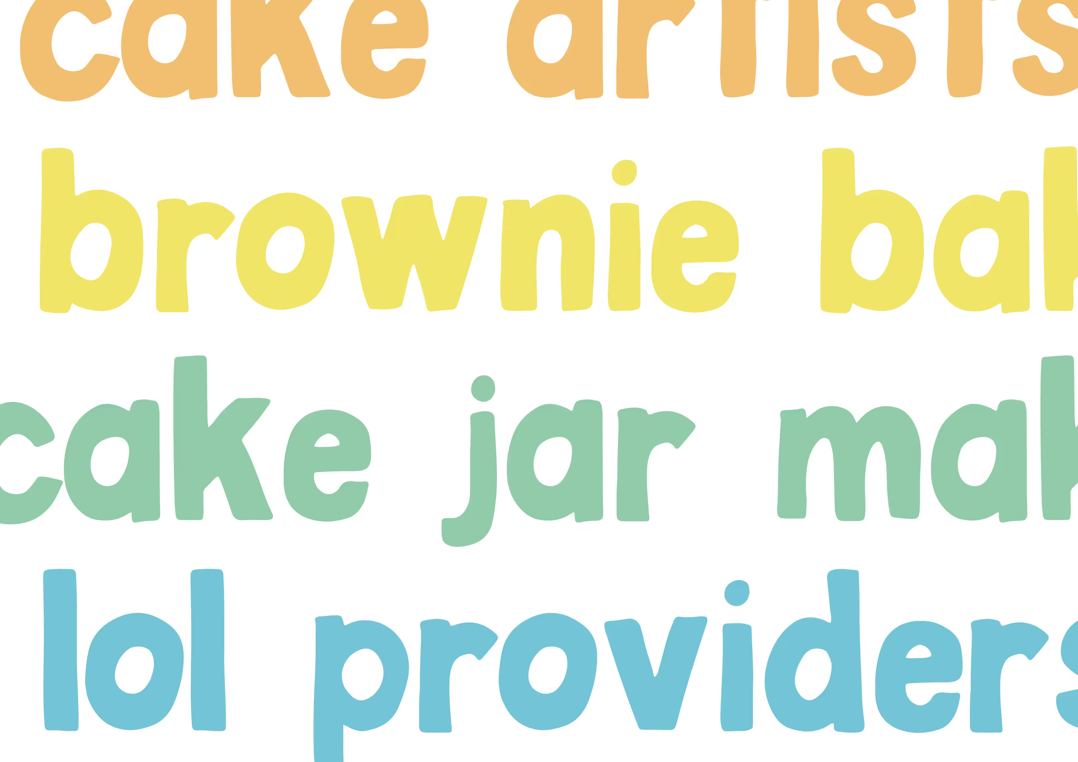
Distinctive typography gives Finch confidence without making it feel polished or corporate. Its informal character reflects the founders’ natural voice, while strong scale and unapologetic compositions match the impact of the products themselves.

A vivid, pink-led palette moves decisively beyond the original black-and-white identity. Combined with the spiral, it creates a visual system that feels structured enough to remain recognisable and energetic enough to remain authentically Finch.

Designed to arrive with impact

As nationwide delivery grew, the brand needed to turn every order into a recognisable Finch Bakery experience.

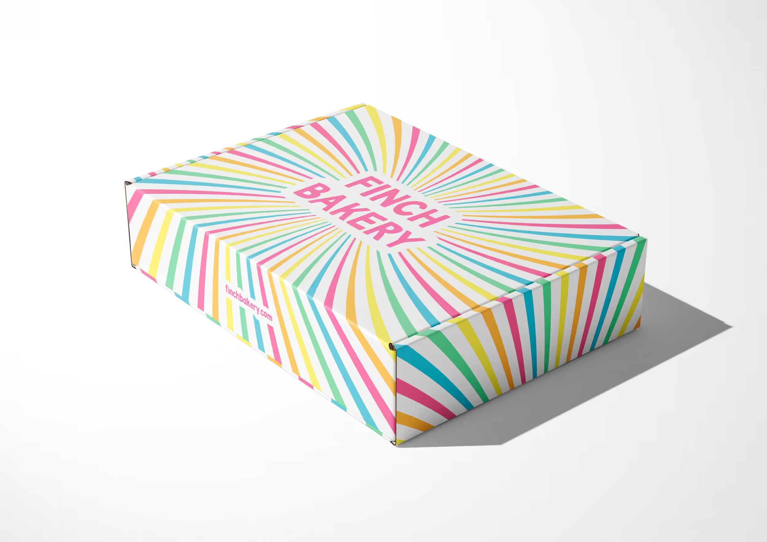
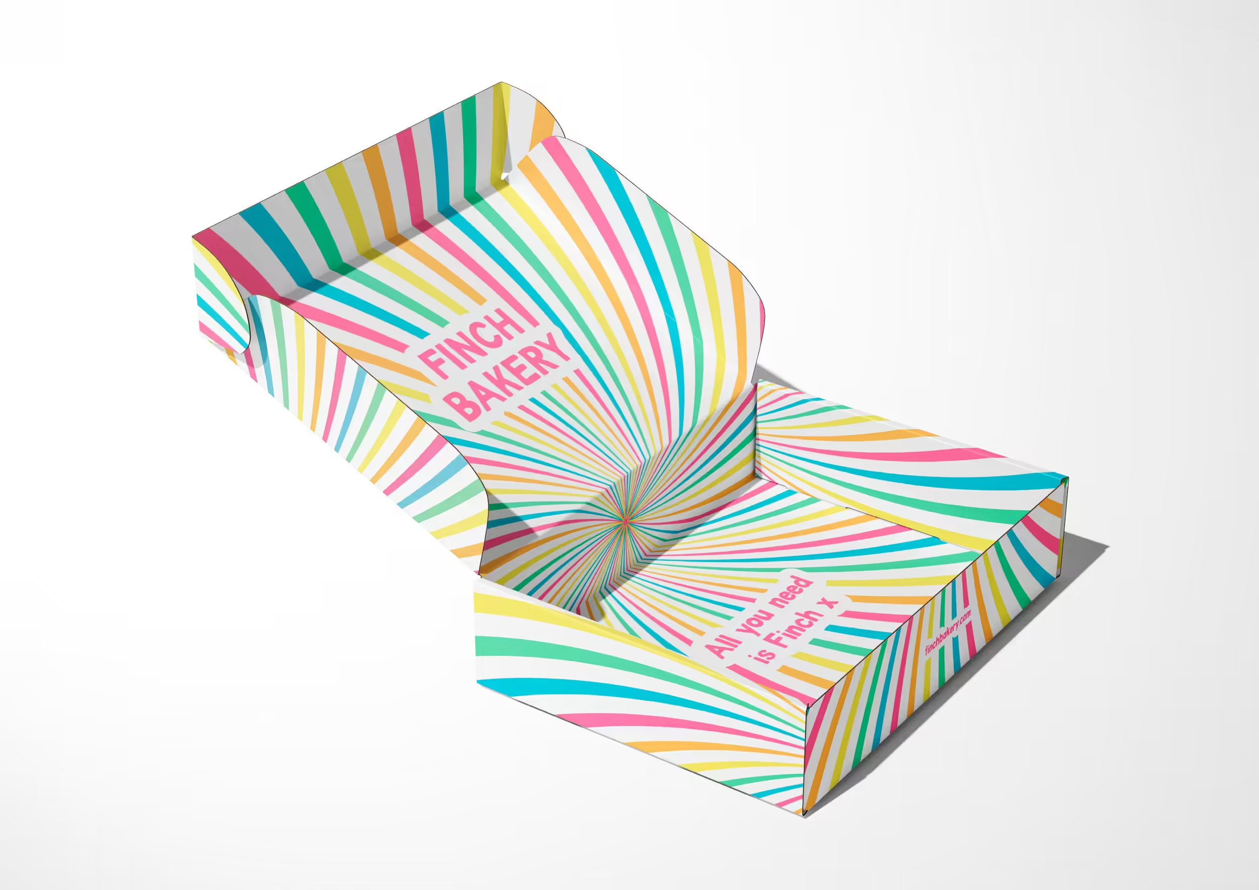
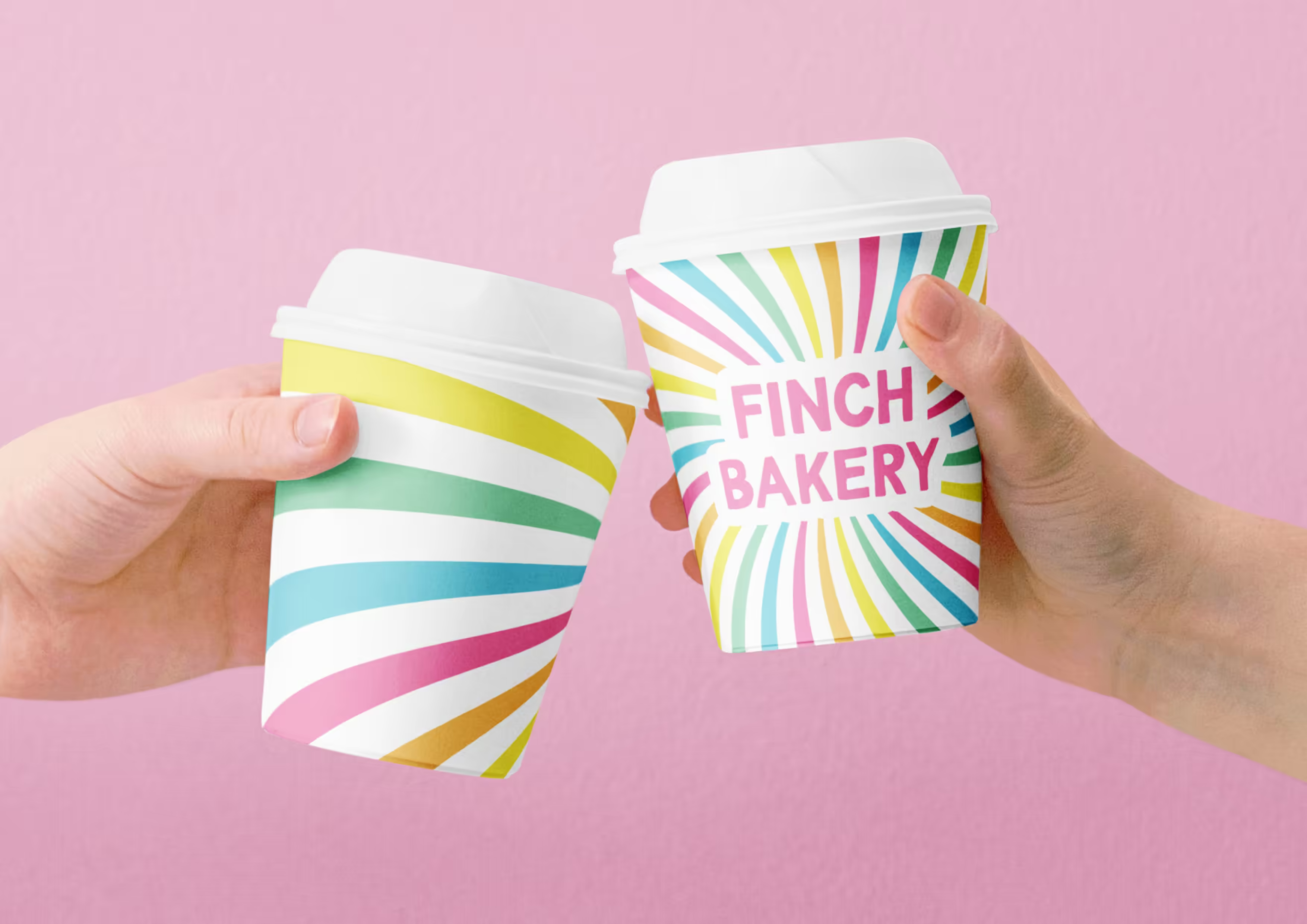
The spiral was translated across high-volume mailing boxes, labels, stickers and cups, balancing visual impact with the practical realities of manufacture and fulfilment. I worked directly with packaging suppliers to resolve dielines, Pantone reproduction and production constraints.

The principal 12-piece brownie box was later adapted into additional formats while retaining the same immediate shelf and doorstep recognition.

One identity, constantly renewed

Finch Bakery operates at the pace of launches, seasons and culture. The identity needed consistency without becoming fixed.

The spiral provides recognition; colour changes the mood. Core and seasonal palettes allow campaigns, messaging, cropping and animation to evolve without Finch losing itself. The system is disciplined enough to scale and permissive enough to match the founders’ fast-moving way of working.

Turning the brand into a book‍

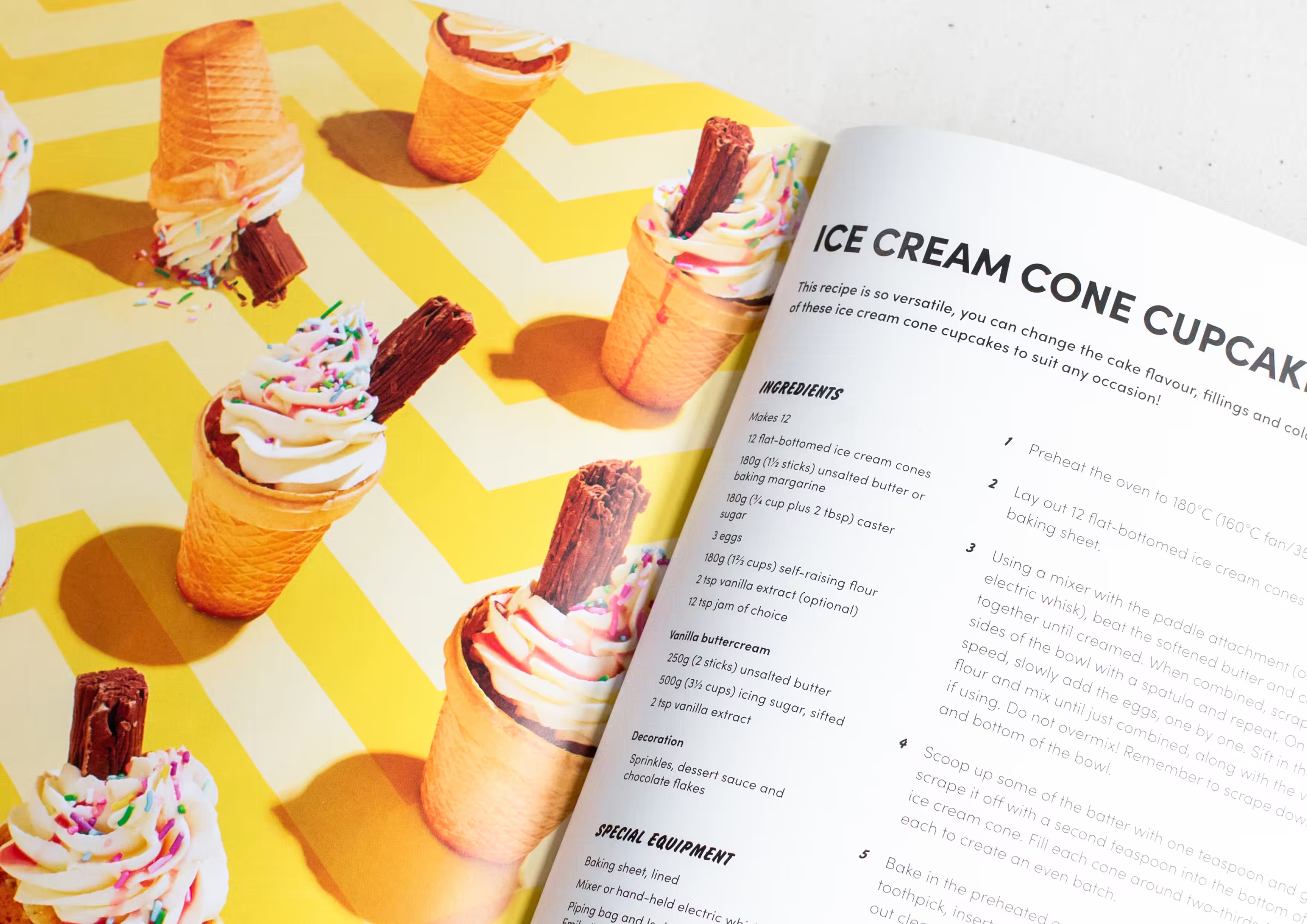
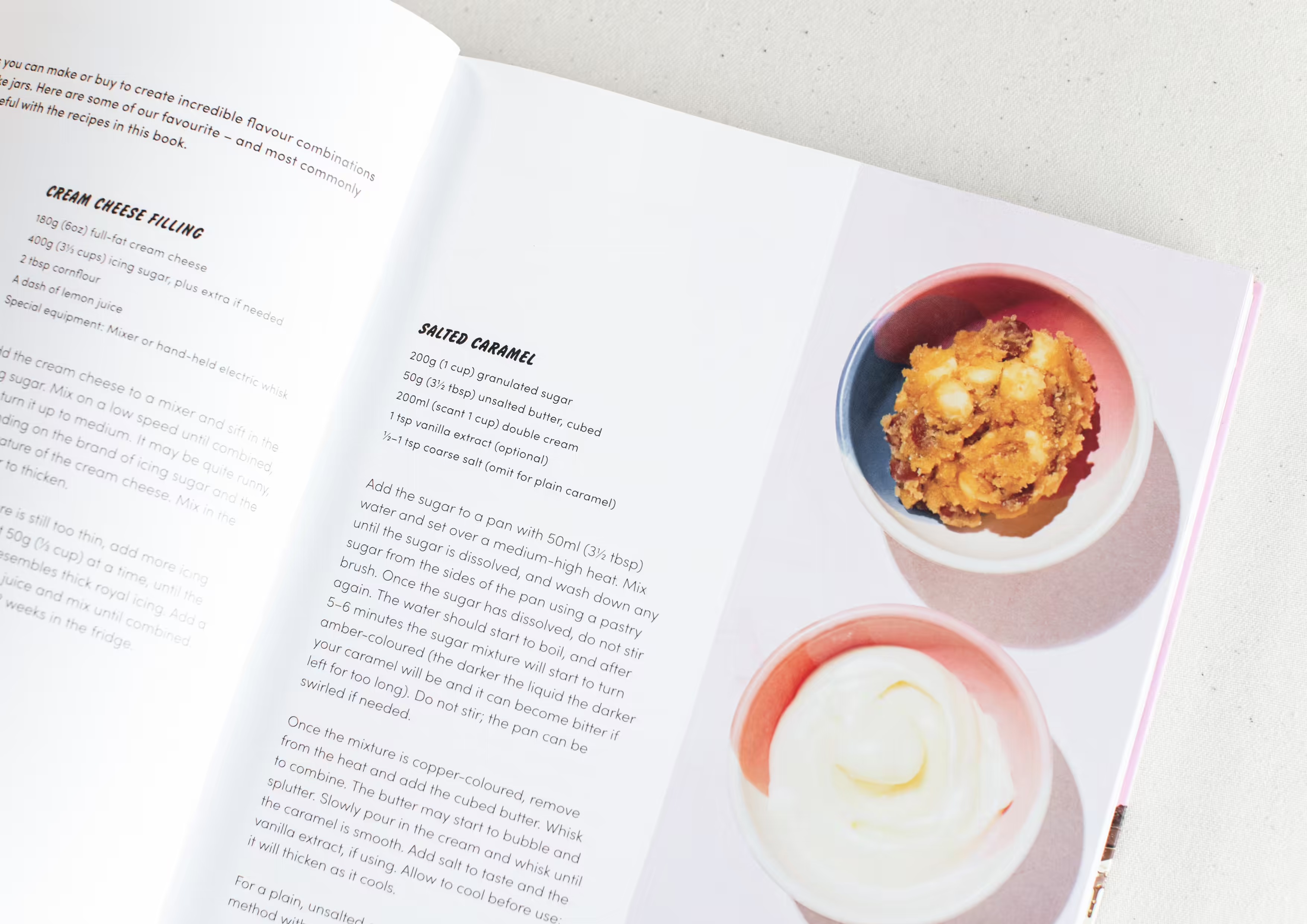
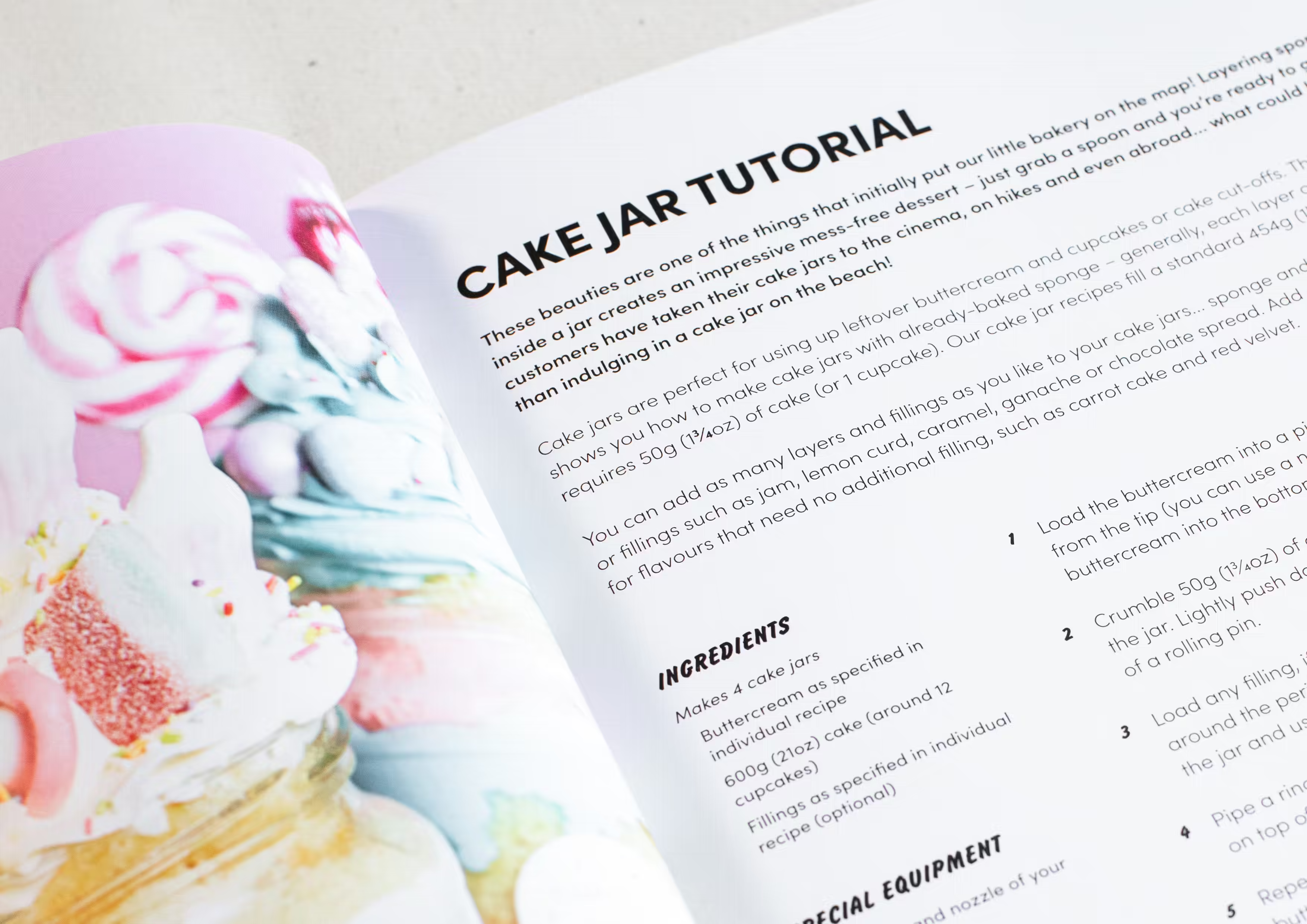
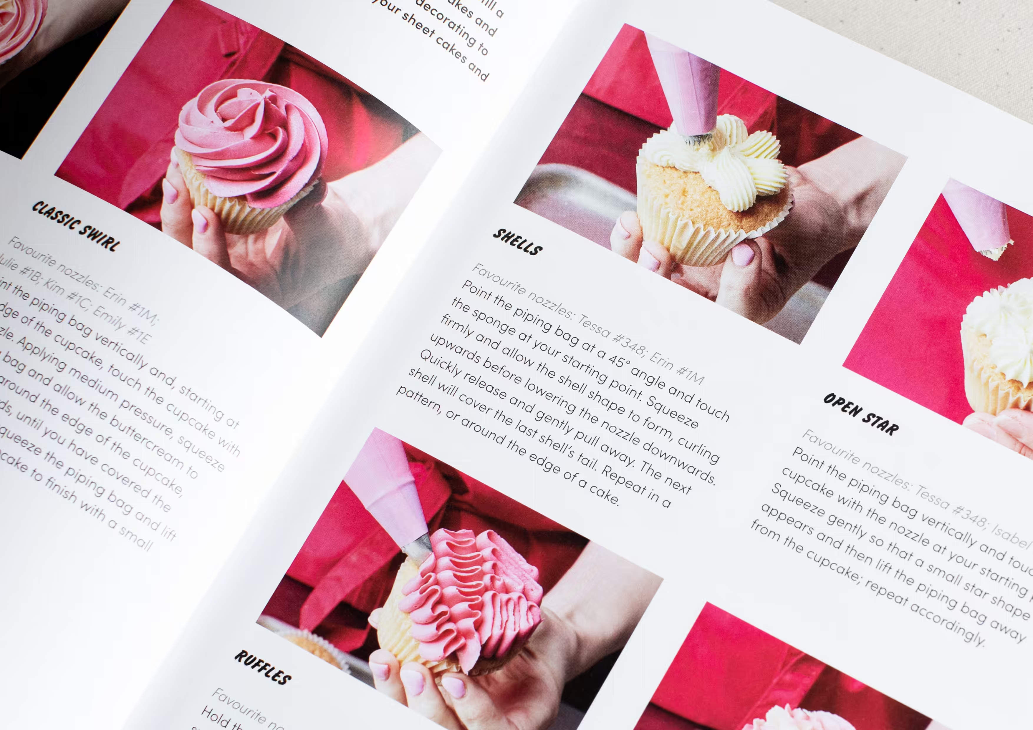
Lauren and Rachel’s first recipe book became an opportunity to expand the identity into a complete editorial and photographic world.

I designed the cover and every internal page, established the creative direction, and worked with DK’s publishing team, photographer and stylists to translate Finch’s maximal products and irreverent personality into 240 pages of colour, craft and confection.

The book became a Sunday Times bestseller and won Wordery Book of the Year in the Food & Drink category.

The visual and editorial framework was adopted for Lauren and Rachel’s second book, demonstrating its ability to extend into an ongoing publishing series.

A brand built to grow with the business

Since our relationship began in 2019, Finch Bakery has grown from one popular Lancashire shop into a nationally recognised consumer brand.

The business now spans nationwide delivery, multiple production facilities and stores, retail concessions, wholesale partnerships and publishing. The identity continues to evolve alongside it, supported by a growing in-house team.

“Jack is a dream to work with, and after initially collaborating on our website, we’ve since completely overhauled our brand, redesigned our packaging and delivery van, and created our best-selling recipe book together too. The creativity that Jack puts into all of his work is unmatched, and we can’t wait to continue working with him on all of our future projects.”

Lauren & Rachel Finch
Lyrics
Collaborators

DK
Publisher

Jessica Griffiths
Photography

Dominique Eloïse Alexander
Food styling

Charlie Phillips
Prop styling